Some of the most critical elements of office design don’t jump out immediately. OK – there could be an ostentatious statue of a tiger in a lobby, or a set of “napping pods” in a corner, but more often than not, the aspects of office design that have the most influence on a company’s mood and productivity are subtle.
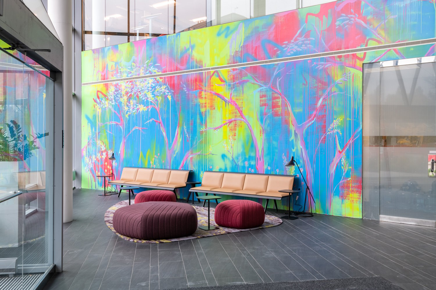
One such thing is simple: color. The color of a room has a dramatic impact on those within it. For example, warmer colors or earth tones have both been shown to encourage conversation because they have a disarming effect on people who are surrounded by them. On the other hand, blue is considered to be the “color of concentration,” and while it might diminish communication, it encourages individual productivity
We’ve talked a bit about how companies should define different spaces in their office. The benefits of having separate spaces designed for different types of work – and workers – can have an enormous impact on employee productivity and happiness. Choosing the right color is an important first step in defining these spaces.
According to Angela Wright, a world-renowned color psychologist, four primary colors affect four different parts of human beings:
Blue: The color blue most closely affects the mind and more so – the ability to focus.
Yellow: Yellow evokes emotion and invites the ego to take center stage. This is perfect for encouraging creativity because it often takes a sense of pride in one’s work to take chances and develop new solutions.
Red: This one is all physical. The color red has been scientifically proven to have the ability to increase the heart rate of anyone near it. It can induce stress in some cases, but it can also act as a motivator to move quickly and get sh*t done.
Green: Ahh, calming green. It creates a sense of balance and soothes the mind. It can be effective in reducing stress and depending on the person, it could actually increase focus even more than blue.
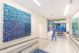
But – that’s exactly it. These are general guidelines. Colors will still affect different people in different ways. This is why workspaces need color balance. And office artwork – or more specifically the way the color of the artwork interplays with the color of the wall is what takes this to the next level.
For example, employees that need uninterrupted focus to do their best work may very well be suited for a blue room. However, if they need to work quickly and efficiently, it would make sense to contrast the blue with red artwork. This way, employees aren’t entirely stressed out by the commotion caused by red, but they feel a sense of urgency.
Similarly, creative types could benefit from a mix of greens and yellows. Yellow to inspire and inflate their ego, but green to bring them back to Earth and focus.
Of course, in modern offices, employees won’t stay in the same place all day. Conference rooms are used, hallways are travelled, and companies should also be encouraging the use of common spaces to collaborate openly. It’s absolutely paramount to outfit these areas with the right colors to accomplish their intended purpose.
It’s also important that the same colors aren’t utilized over and over again. Employees benefit from entering new mindsets when they enter new rooms and the transition from a blue focus room, to a green collaboration space can refresh them and increase overall productivity throughout the day.
At this point, all of this might sound a bit crazy. Should every room be slathered in drastically different bold colors? Absolutely not! That would be dizzying. Choosing the right color saturation is very important too.
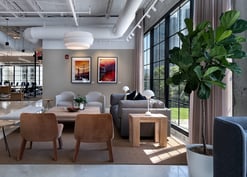
Wall paint with lower saturation can set the underlying tone of a room, and the artwork chosen will drive the point home. Or, vice-versa, if a wall is painted with a dark color; subdued artwork can become a focal point. This is especially effective when going for a more modern look.
There are literally millions of color combinations that can come together to improve the effectiveness of a space. If you have questions on how to use color to improve where you and your team works, click the button below! We’re happy to help.

.jpg?width=332&height=177&name=_MG_0840%20copy%20(2).jpg)
.jpg?width=332&height=177&name=dtBv_067_DSC_2139_DaNil%20(2).jpg)

.jpg?width=332&height=177&name=TurningArt_EnerNoc_2-18-2014-3_Final%20(1).jpg)


