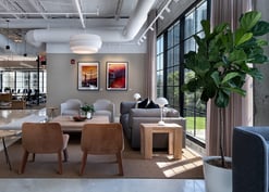
Art is an accessible and relatively low-cost option that, when considered with intention, has an impressive ability to energize the workplace and bring employees closer together. However, with the vast magnitude of talented artists and an endless list of artwork styles, choosing artwork your employees will enjoy may seem daunting. This is where TurningArt’s turnkey rotational programming comes in handy.
Our process begins with a brief consultation with one of our Art Advisors to discuss your project objectives. One of the central purposes of this call is to align on the stylistic direction of your collection so that your Art Advisor can choose artwork that: resonates with your employees, enhances the environment’s aesthetics, and helps to achieve your objectives for your space. This blog discusses three essential elements you should consider when starting your art selection journey.
Three Key Elements to Consider
1. Branding
By carefully selecting artwork that reflects your company's brand and colors, you create a visual narrative that reinforces your company’s purpose and resonates with both employees and visitors. Color also plays a large part in dictating the energy of your workplace. If you want a calm and relaxing space, you might choose soft colors and muted tones. If you want a more energetic and stimulating space, you might choose brighter colors and bolder patterns.
Below is a selection of works from a firm that wanted their collection to include the blue mountain hues from their logo. Their Art Advisor then offset these cool tones with brighter pops of color to give the office more visual energy and diversity of color.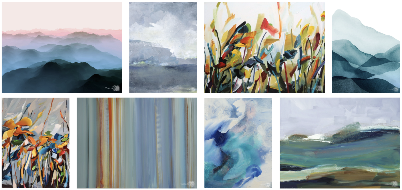
2. Landmarks and Icons
Incorporating artwork featuring local landmarks creates a meaningful connection between your space and its surroundings. By showcasing images of iconic buildings, natural landscapes, or cultural symbols, you create a visual narrative that resonates with employees while supporting local artists.
This approach not only celebrates the local community but also serves as a conversation starter, sparking discussions and fostering a sense of belonging among employees. For larger, multi-office organizations, this is a great way to bring a unique feel to each of your locations.
Below is an example of what a collection could look like in a St. Louis office. Incorporating a mix of photography with abstract impressionistic works elevates the feel of this collection. Included here are also works from artists local to the city that do not literally depict the city but still capture its essence, adding additional visual and conceptual intrigue to the collection.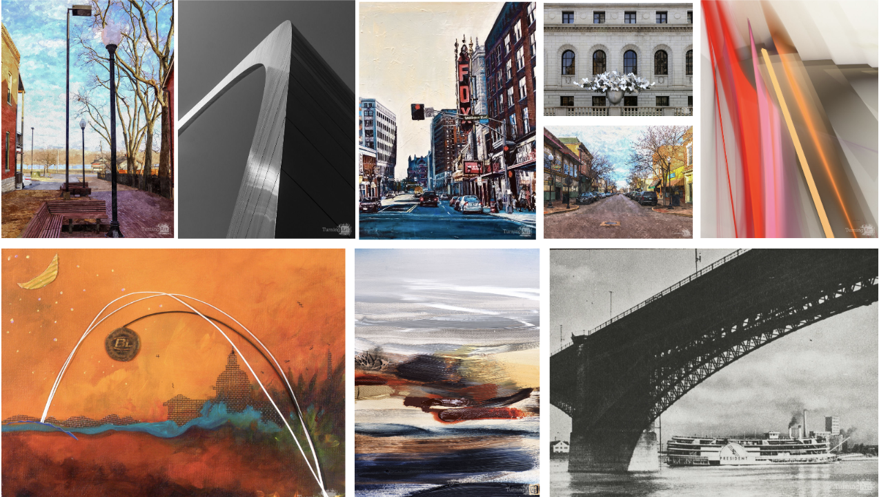
3. Values and Keywords
Whether it's words like innovation, collaboration, diversity, or sustainability, these principles serve as a constant reminder as to why you show up to work. When the artwork in your office harmonizes with your company's values, it strengthens the organizational culture and creates an environment where employees feel a deep connection and pride in their work.
Below you can see an example of an office with the words “Connective & Collaborative” central to their values. Here you can find both abstract and representational imagery of bridges as a symbol of connection, while the variety of compositions and styles creates a more dynamic interpretation of the theme. A beacon of light from a lighthouse and overlapping geometric shapes invoke the idea of a greeting or handshake to touch on their theme of collaboration. Subtle and thoughtful interpretations of themes create an exciting depth to any collection while ensuring the concepts remain cohesive.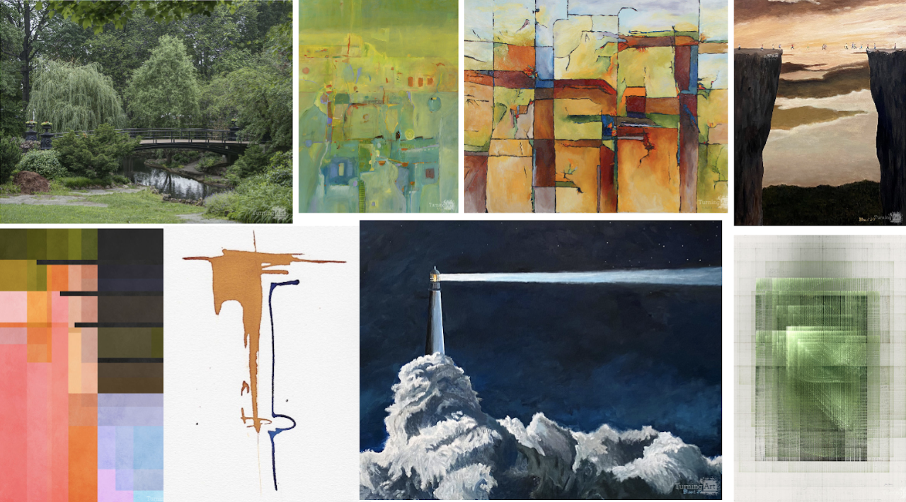
Next Steps
While landing on stylistic direction is an important step to defining your artwork scope, there are several other factors, like artwork placement, size, and material, that help our art advisors build these beautiful custom collections. To get started on your artwork journey, click the button below to get connected with an Art Advisor for your complimentary first call.

.jpg?width=332&height=177&name=_MG_0840%20copy%20(2).jpg)
.jpg?width=332&height=177&name=dtBv_067_DSC_2139_DaNil%20(2).jpg)

